



Beyond Surface Drama into the Architecture of Light
Look closely at a successful chiaroscuro image and the first impression may be theatrical darkness, but its real achievement is more exacting. Chiaroscuro, literally “light-dark,” is the deliberate organization of illumination, shadow, edge, and tonal density so that a flat surface suggests solid form. It is not simply a black background behind a bright figure. It is an optical structure in which every transition, from the sharp contour of a cheek to the barely perceptible turn of a shoulder, tells the eye how to read space.
This distinction matters for painters, illustrators, collectors, and anyone assessing visual authority. The defining question is not how much contrast an image contains, but whether contrast has been placed with intention. A highlight can describe a convex plane, a softened half-tone can turn the head away from the light, and a carefully reserved dark can establish depth without becoming an empty hole. Classical scholarship, including this Checking your browser resource and this authoritative history of chiaroscuro, places the technique within the long development of volumetric form on a two-dimensional plane.
Historically, artists moved from graphic indications of shadow toward increasingly continuous systems of modeling. Renaissance painters used gradual tonal transitions, especially in oil, to make bodies appear to occupy air and space. Later artists intensified the principle through focused illumination and enveloping darkness. Contemporary practitioners continue the same investigation with ink, photography, animation, and digital layers. The tools have changed, yet the underlying mechanics remain familiar: control the value range, decide where edges dissolve, and regulate the passage between reflected light and optical density.
Caravaggio and the Alchemy of Indirect Oil Glazing
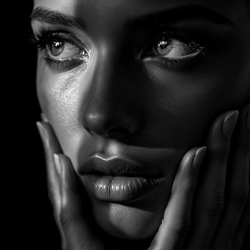
Caravaggio”s contribution was not the invention of darkness, but its conversion into a concentrated dramatic force. His tenebrism gathers attention around illuminated bodies and faces while allowing surrounding space to recede into deep shadow. The effect depends on more than extreme value contrast. Strong naturalist drawing, a limited palette, close compositional focus, and disciplined placement of the highest lights create an image in which the viewer feels that illumination has entered from a specific direction. The darkness becomes spatially active rather than merely decorative.
In oil painting, such authority can be built through a sequence of layers. A toned ground, often established with a warm umber wash over a light brown preparation, prevents the painting from beginning on an optically sterile white. A darker underpainting or grisaille-like structure then establishes the principal masses before local color is fully developed. Subsequent scumbling introduces lighter passages with a broken, receptive surface, while translucent glazes deepen selected areas without covering the underlying modeling. The process described in practical accounts of tenebrist painting often proceeds from the initial placement of facial masses, through scumbled light, to final highlights, darkest accents, and middle-tone adjustments.
The optical distinction between a glaze and an opaque stroke is fundamental. Opaque paint reflects light from pigment particles near the surface, whereas a translucent resinous layer allows light to travel through the film, interact with lower layers, and return with modified color and depth. This is not literal illumination passing through a window, but a complex scattering process within the paint film. It gives glazes their characteristic richness and permits a dark passage to remain visually alive. Modern opaque media can imitate the appearance, but they do not reproduce the same material path unless their transparency, surface gloss, and layering are carefully controlled.
- Imprimatura: a thin overall tone that reduces the glare of the ground and establishes a chromatic atmosphere.
- Underpainting: a structural map of the major lights, shadows, and planes before surface detail takes over.
- Scumbling: a relatively opaque, broken application that catches the texture of the surface and softens transitions.
- Glazing: a transparent or translucent layer that modifies the color and density of what lies beneath.
- Final accents: selective lights and darks that clarify focal hierarchy rather than outlining every form equally.
Comparative Mechanics Across Five Centuries of Mediums
Across five centuries, artists have repeatedly confronted the same perceptual problem with different physical resources. Renaissance oil glazing offers prolonged blending and optical depth. Ink wash relies on water, absorbency, and the timing of a brushstroke. Digital painting offers nearly unlimited reversibility, opacity control, and layer mathematics. Each medium can suggest volume, but each produces a different relationship between edge, atmosphere, and surface.
| Medium | Primary control | Characteristic limitation | Typical depth effect |
|---|---|---|---|
| Oil glaze | Transparent layering and surface reflection | Drying time, material stability, and accumulated film | Rich chromatic shadows and gradual modeling |
| Ink wash | Water-to-ink ratio and absorbent paper | Limited correction once the wash has settled | Atmospheric recession and expressive tonal flow |
| Pen and ink | Line density, direction, and hatch spacing | Continuous tone must be translated into marks | Graphic volume and directional texture |
| Digital painting | Opacity, masks, blend modes, and pixel gradients | Ease of blending can flatten intention | Precise value control, if edges remain selective |
Edge feathering is especially revealing. An oil painter may soften a transition by manipulating wet paint or by placing a transparent veil over a modeled passage. An ink artist may widen the interval between marks, dilute a wash, or allow paper to carry the light. A digital artist can blur, mask, or reduce opacity, but mechanical softness is not automatically convincing. Recent empirical work on visual perception and aesthetics, including this eye-tracking study on gaze distribution and visual attention in art, helps clarify how tonal structure and localized contrast guide visual fixation. The eye responds not only to the darkest and lightest values, but also to the organization of their boundaries.
Ink Washes and Halftone Rendering in Graphic Traditions
Ink traditions translate continuous illumination into a vocabulary of marks. A wash can describe a broad plane, while a contour or hatch can specify its orientation. Cross-hatching builds density through intersecting directions, allowing the artist to imply rounded form without filling every passage with uniform black. The most persuasive pen work does not treat line as an outline placed around an object. It treats line as a record of turning surfaces, pressure, texture, and the direction in which light is being received.
East Asian ink painting offers another model of tonal intelligence. Diluted ink and water create transitions that are not always anatomical in a Western modeling sense, yet they can convey atmosphere, weight, distance, and emotional temperature. The 1960 Chinese ink animation Little Tadpoles Looking for Mama is a notable example of traditional ink principles being carried into frame-by-frame movement. Changing washes, expressive brushwork, and simplified forms preserve the spirit of ink painting while technology introduces continuity and motion. Contemporary storyboarding and comics similarly move between fluid wash and precise pen language according to genre, pace, and psychological mood.
Arthur Guptill”s approach to pen rendering remains useful as an analog counterpart to digital value control, even when a particular secondary source presents his work in promotional form rather than offering a complete scholarly edition. The practical principle is clear: line density must be organized, not accumulated indiscriminately. Close, dark marks can describe a recessed plane; open spacing can preserve a light-facing surface; changes in direction can wrap a form. The same logic governs halftone textures and digital brushes. What matters is not the number of marks, but whether their density supports the larger value architecture.
- Reserve the cleanest paper or brightest ground for the true light-facing passages.
- Increase hatch density gradually when a plane turns away from the light.
- Change mark direction to follow cylindrical, spherical, or folded forms.
- Use solid black sparingly, especially near the focal point where it carries the greatest visual weight.
- Allow atmospheric passages to remain quieter than the primary subject.
Digital Values and Precision Masking in Contemporary Workflows
Digital tools can reproduce many aspects of layered optical modeling, but their strength lies in control rather than automatic realism. Multiply darkens by combining values, making it useful for transparent shadow layers. Overlay can increase local contrast while preserving some of the underlying image. Color Dodge can intensify luminous accents, although it is easily overused and can produce brittle, electronic highlights. A disciplined workflow treats these modes as instruments within a hierarchy, not as shortcuts to finish.
To construct a convincing digital sphere, begin with a middle-value base rather than a pure white shape. Establish the cast shadow and ambient occlusion, then place a broad light family that turns gradually across the surface. The highlight should occupy a limited area and should not be mistaken for the entire light side. Reflected light belongs inside the shadow family, but it should remain subordinate to the key light. Edge variation completes the illusion: one contour may sharpen where the sphere meets a contrasting background, while another can dissolve into surrounding value.
- Fill the sphere with a neutral middle value and define its silhouette cleanly.
- Place the cast shadow beneath and to the side, using a soft edge near the contact point and a lighter, broader edge farther away.
- Apply a masked Multiply layer for the turning shadow, preserving the base color beneath it.
- Build the light with a controlled gradient, then refine the form manually so the gradient does not appear mechanically uniform.
- Add restrained ambient occlusion where the sphere approaches the ground plane, avoiding an exaggerated dark ring.
- Introduce a small highlight with a normal or lightening layer, then soften its boundary according to the imagined surface.
- Inspect the image in grayscale and at thumbnail size to confirm that the value structure survives without color.
The principal digital danger is not insufficient technology but excessive compliance with it. A global blur gives every edge the same softness, and an automated gradient distributes light without regard for anatomy, material, or compositional focus. Intentional hand-feathering restores hierarchy. Hard edges should clarify structure, soft edges should describe turning or atmosphere, and lost edges should allow forms to merge when separation would weaken the image. Digital precision becomes expressive only when the artist decides where precision should stop.
Cultivating Intentional Depth in Every Visual Medium
Chiaroscuro endures because it is less a period style than a way of thinking. The Renaissance glaze, the Caravaggesque beam of light, the diluted ink wash, the carefully spaced hatch, and the masked digital shadow all ask the same questions: where does form turn, where does space recede, and which transition deserves the viewer”s attention? Classical edge control remains directly relevant to contemporary practice because pixels, like pigment and paper, become persuasive only when their relationships are organized.
For collectors and curators, authentic tonal depth is often visible in restraint. Superficial high contrast announces itself quickly, but sustained modeling reveals whether an artist understands the behavior of light across planes. Look for shadows that retain internal variation, highlights that occupy purposeful rather than excessive areas, and edges that change according to form and atmosphere. In the studio, begin with a clear value map, build density gradually, and reserve the strongest contrast for the image”s true structural or emotional center. That practice turns chiaroscuro from a dramatic effect into what it has always been: a precise architecture of seeing.