

Unlocking the Canvas Without an Academic Playbook
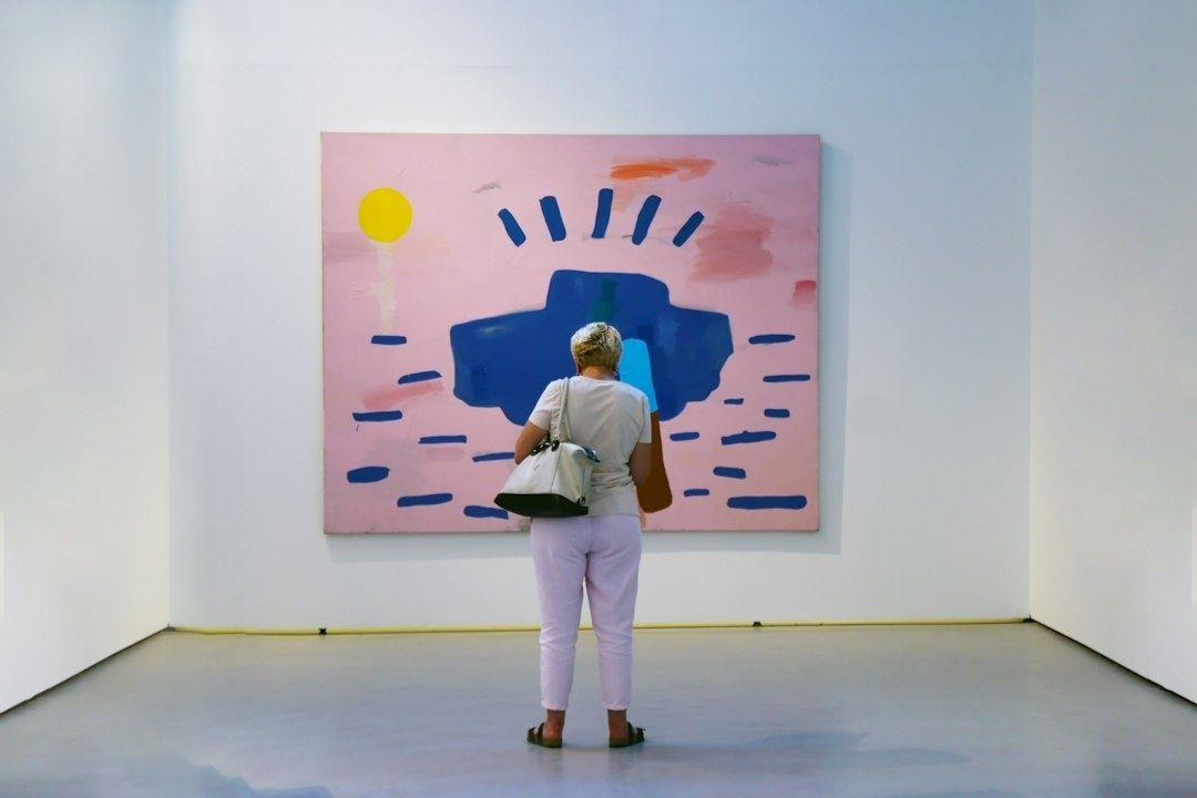
Standing before a non-representational painting in a modern gallery can produce an oddly specific kind of hesitation. There may be no face to recognize, landscape to identify, or historical event to place. Instead, the viewer encounters bands of colour, scraped surfaces, hovering forms, abrupt gestures, or an apparently empty field. The pressure to understand can become so intense that looking gives way to silent self-examination: is there a correct answer, and has everyone else already found it?
That anxiety begins to loosen when the question changes. Rather than asking what the painting depicts, ask what it does. How does the surface behave? Where does the eye settle, accelerate, or hesitate? Which passages feel heavy, exposed, warm, distant, agitated, or still? Understanding abstract art begins with recognizing its departure from narrative subject matter, but it does not end there. The painting becomes an encounter with physical relationships, not a puzzle requiring a secret cipher.
A useful method is to proceed through four connected stages: mark-making, visual weight, rhythm, and colour temperature. These are not rigid rules, nor are they substitutes for historical context. They are practical ways of moving from observation to interpretation. First notice the physical evidence of the artist”s actions. Then consider how masses and spaces balance. Follow the routes created for the eye, and finally attend to the emotional climate established by colour. The result is a direct, informed response grounded in what is actually present on the canvas.
Step One Reading the Anatomy of Mark-Making
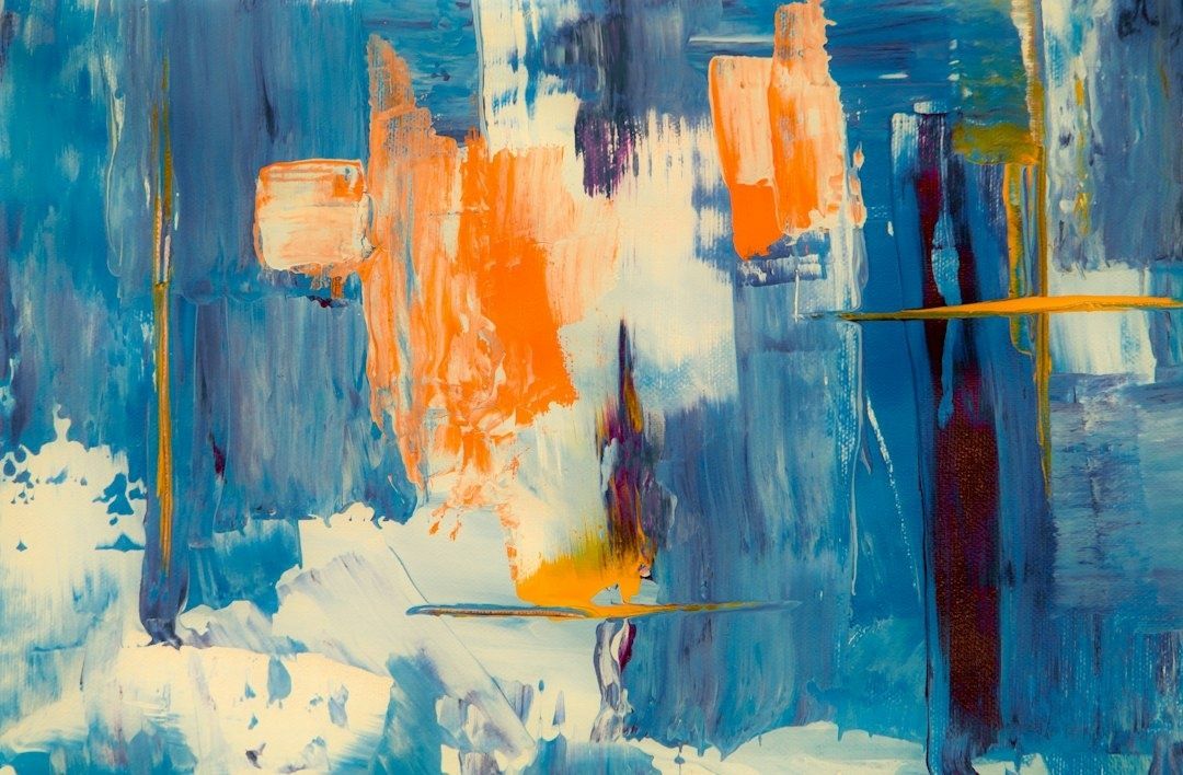
Begin with the surface itself. A mark is not merely a line or patch of pigment; it is a record of contact between tool, material, and support. Look closely at whether the paint has been brushed, dragged, poured, pressed, scraped, or dabbed. A narrow stroke may reveal a controlled wrist and a steady speed, while a broad, broken passage can suggest a heavier tool, a faster movement, or a deliberate interruption. Even when no gesture is visible as an image, its physical consequence remains available to the eye.
Texture makes this evidence especially legible. Impasto, where paint stands proud of the surface, catches light across its ridges and can make the painting seem almost sculptural. Carefully built impasto may give a passage architectural firmness, as if each ridge were reinforcing the composition. By contrast, diluted washes allow the ground to remain visible and create an atmosphere of permeability. Spatters, drips, and accidental-looking edges can introduce speed, instability, or openness. The important question is not whether a mark appears controlled or spontaneous in isolation, but how its character participates in the work as a whole.
Abstract painting often communicates motion directly through the body”s sensitivity to gesture. A looping line may feel continuous even when it stops; a sharp diagonal may produce a sensation of impact; a cluster of short strokes can create visual agitation. This is why the physical trace deserves attention before symbolic interpretation. The viewer does not need to decide what a mark represents in order to register its velocity, pressure, direction, and resistance.
- Observe the tool”s apparent pressure and the thickness of the paint.
- Notice whether edges are crisp, feathered, scraped, pooled, or broken.
- Compare deliberate passages with areas that seem poured, splashed, or allowed to settle.
- Ask how the marks affect the body: do they slow the gaze, provoke tension, or invite movement?
Step Two Navigating Visual Weight and Structural Balance
Once the marks have been examined, step back and consider the painting”s overall distribution. In figurative art, a person, building, or horizon may provide an immediate anchor. Abstraction must establish orientation through other means: scale, contrast, density, colour, texture, and placement. A dark, compact shape can carry considerable visual weight even if it occupies little space. A pale field may cover most of the canvas yet remain deliberately light, allowing a small saturated accent to command attention.
Look for the relationship between dense clusters and open space. A heavily worked corner may pull the composition toward it, while a broad unpainted or softly painted area can provide relief. Negative space is not empty in any passive sense. It can create suspension, silence, distance, or pressure, depending on how it relates to surrounding forms. The painting”s balance may feel stable, but it may also be intentionally precarious, as though one mass is about to shift beyond the edge.
There is rarely a need to search for perfect symmetry. Abstract compositions often depend on intuitive equilibrium rather than mirrored halves. A small, vivid form might balance a large, muted one; a textured foreground might be countered by a high-contrast edge in the distance. Standard principles of formal analysis can help viewers unpack these spatial dynamics, but an Authoritative Source can offer further guidance. These principles should be treated as a vocabulary for looking, not a formula for judging.
| Visual feature | Question to ask | Possible effect |
|---|---|---|
| Dense cluster | Where is pigment, texture, or contrast concentrated? | Emphasis, pressure, gravity, or visual authority |
| Open field | What does the quieter space allow the eye to do? | Rest, suspension, distance, or spaciousness |
| Dark value | Does the deepest tone anchor or destabilize the image? | Weight, depth, drama, or enclosure |
| Edge placement | Do forms stop comfortably inside the frame or press against it? | Containment, expansion, or implied continuation |
Composition is best understood as a set of relationships rather than a checklist. A warm shape may become heavier beside a cool field; a sharp edge may gain force because nearby forms are soft; an isolated accent may unify distant areas through repetition. Such decisions can be planned, revised, or discovered during the making of the work. What matters to the viewer is the resulting coherence, including moments where coherence deliberately gives way to tension.
Step Three Tracking Visual Rhythm and Eye Movement
After identifying the painting”s major weights, follow its movement. Repeated shapes, parallel lines, recurring colours, and related textures establish visual rhythm. The eye may travel along a diagonal, return to a repeated mark, or circulate between separated areas that share a colour or edge. These connections can be subtle. A small red interval may answer a larger red field across the canvas, while a sequence of vertical strokes may create an implied cadence.
Rhythm also has tempo. Short, nervous strokes can feel staccato, while broad arcs and extended transitions produce a more lyrical pace. A painting may begin with visual acceleration and then open into stillness, or maintain a deliberately unsettled beat throughout. To read this movement, resist the temptation to scan the entire work too quickly. Let the eye pause where the artist has created resistance, then notice what pulls it onward.
- Locate the first passage that captures attention.
- Trace the line, colour, shape, or contrast that leads away from it.
- Notice where the eye returns and which areas remain overlooked.
- Compare the painting”s rapid passages with its slower, more spacious intervals.
This exercise reveals that viewing is partly choreographed. The artist may not dictate a single route, but the arrangement of accents, overlaps, diagonals, and pauses encourages certain sequences. Repetition creates expectation, while variation prevents monotony. A mark that returns in altered scale or colour can act like a musical motif, preserving continuity while changing its emotional register.
Step Four Decoding Color Temperature and Emotional Climate
Colour often produces the most immediate physical response, yet it is also one of the easiest elements to over-symbolize. Warm colours such as reds, oranges, and yellows can appear to advance, intensify, or gather heat. Cool blues, greens, and violets may seem to recede or create distance. These effects are not universal commands. A cool, saturated blue can be forceful and electric, while a muted orange may feel dusty and restrained. Temperature depends on relationships, not isolated colour names.
Attend to changes in chroma, value, and saturation. A bright passage beside greyed tones can act like a flare, even if it is small. Closely related hues may produce a quiet, enveloping atmosphere, while abrupt colour shifts create friction. Transparent layers can make colour feel suspended beneath the surface; opaque blocks can give it physical authority. In both cases, the emotional climate emerges from the interaction of colour with space, texture, and rhythm.
The most reliable interpretation begins with sensation before symbolism. Does the palette feel expansive, compressed, luminous, brittle, humid, nocturnal, or alert? Those responses are not less sophisticated because they are embodied. They are evidence of how the work operates. Context may later enrich the encounter, especially when the artist”s materials, historical moment, or stated concerns become known, but the initial sensory reading remains valuable.
- Compare warm and cool passages rather than judging them separately.
- Identify the most saturated colour and observe how much space it occupies.
- Notice whether colour advances through contrast or recedes through similarity.
- Describe the atmosphere in physical terms before assigning symbolic meaning.
Standing in Front of the Next White Cube with Confidence
A sustained encounter with abstract painting brings these four stages together. Mark-making reveals how the artist”s actions remain embedded in the surface. Visual weight shows how the image holds or unsettles itself. Rhythm explains the movement of the eye, while colour temperature establishes an emotional climate. None of these elements operates alone. A thick black stroke may be heavy because of its value, urgent because of its direction, and emotionally severe because it interrupts a pale, cool field.
The viewer”s immediate response deserves a place beside curatorial language, not beneath it. A feeling of resistance, calm, irritation, attraction, or uncertainty can be the beginning of serious looking. In a gallery, spend time at different distances, return to details, and read the wall text only after making an initial observation. Record a few precise notes about what is visible and what is felt. With practice, the apparent silence of abstraction becomes richly articulated. The next white cube need not be approached with trepidation, but with curiosity, patience, and the confidence to let the painting speak through its own material intelligence.